
Tuesday, November 22, 2011
#45 - Correlation Matrix
A Correlation Matrix displays multiple sets of similar data.
http://genomebiology.com/content/figures/gb-2008-9-8-r129-4-l.jpg
#44 - Similarity Matrix
A Similarity Matrix shows the things that different variables have in common, like the audio similarity matrix below.
 http://www.springerimages.com/Images/ComputerScience/1-10.1007_978-3-642-12337-5_7-8
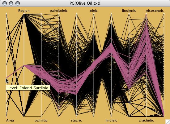
#43 - Parallel Coordinate Graph
Parallel Coordinate Graphs show multiple sets of data in one location, making it easy to read and compare instantly.
 http://www.theusrus.de/Mondrian/
#42 - Windrose
The Windrose seen here is displaying the distribution of wind speed and direction.
 http://www.vistadatavision.com/reports/wind-rose/
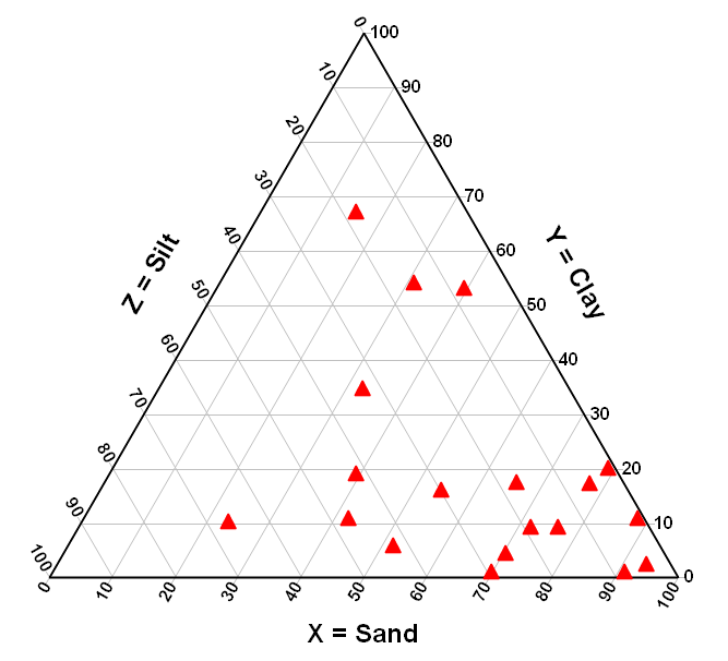
#41 - Triangular Plot
The Triangular Plot uses 3 different variables of data and is generally used in geological studies. The one seen here is plotting silt, clay and sand.
 http://www.dplot.com/triangle-plot.htm
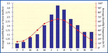
#40 - Climograph
A Climograph shows us the climatic data of a particular place over a specific span of time.
 http://www.jrank.org/history/pages/8346/What-Are-Different-Types-Maps-Graphs.html
#39 - Population Profile
The population profile seen here is basically a bar graph displaying the amount of males and females with age, distributed by age.
 http://www.ifad.org/operations/regional/pf/aids_1.htm
#38 - Star Plot
Star plots measure the relative values for a single data point. In other words, it compares multiple variable to one, single, main objective.
 http://assessment.tki.org.nz/Assessment-tools-resources/Alignment-of-assessment-tools-with-National-Standards/Reading/Observation-Survey
#37 - Index Value Plot
In Index Value Plot seen here shows variations in the stock price index in India between 1965-2008.
 http://www.iimahd.ernet.in/~jrvarma/blog/index.cgi/2009/01/
#36 - Bilateral Graph
A Bilateral Graph see here shows two variables of data, the positive and the negative, and then shows a combination of these two variables.
 http://commerce.nic.in/publications/anualreport_chapter9.asp
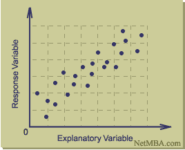
#35 - Scatterplot
A Scatterplot displays and allows the reader to compare to variables' sets of data.
 http://www.netmba.com/statistics/plot/scatter/
#34 - Stem and Leaf Plot
A Stem and Leaf plot is a way of quickly and easily displaying your data, like the simple math plot seen here.
 http://www.icoachmath.com/math_dictionary/Stem-and-Leaf_Plot.html

#32 - Unclassed Choropleth Map
A histograph, like the one the seen here, is a specialized bar graph used to display the distribution of certain data.
 http://www.vistadatavision.com/reports/histogram/
#31 - Classed Choropleth Map
A classed Choropleth map shows data displayed in intervals.
 http://semanticommunity.info/Data.gov/Visualizing_Data_Patterns_with_Micromaps
#30 - Continuously variable proportional circle map
The map below is an example of a continuously variable proportional circle map. This particular one is showing the proportion of various meats imported to Paris.
 https://www.e-education.psu.edu/geog486/book/export/html/1796
#29 - DOQQ
Seen here is a DOQQ, or Digital Orthophoto Quarter Quad, which is a digital aerial photo, displaying both map and photograph qualities.
 http://seamless.usgs.gov/products/1doqq.php
#28 - DEM
The DEM, or Digital Elevation Model, shows the reader a what the bare surface of the ground looks like. The one seen here is a trail map.
 http://superstition-sar.org/maps.htm
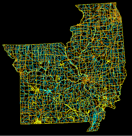
#27 - DLG
The DLG, or Digital Line Graph, seen here is also a product of the USGS and is represented in digital vector form.
 http://www.mapcruzin.com/free-geodata-shapefiles/usgs-geospatial-data-geodata-geographic-download.htm
#26 - DRG
A DRG, or Digital Raster Graph, is a topographic USGS map that has been scanned and digitized.
 http://gislab.lanl.gov/faq.html
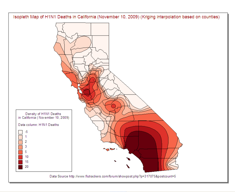
#25 - Isopleths
The Isopleth map seen here is displaying the number of H1N1 related deaths in California in November, 2009. The shading and key make the data easy to read and identify.
 http://www.flutrackers.com/forum/showthread.php?t=132504
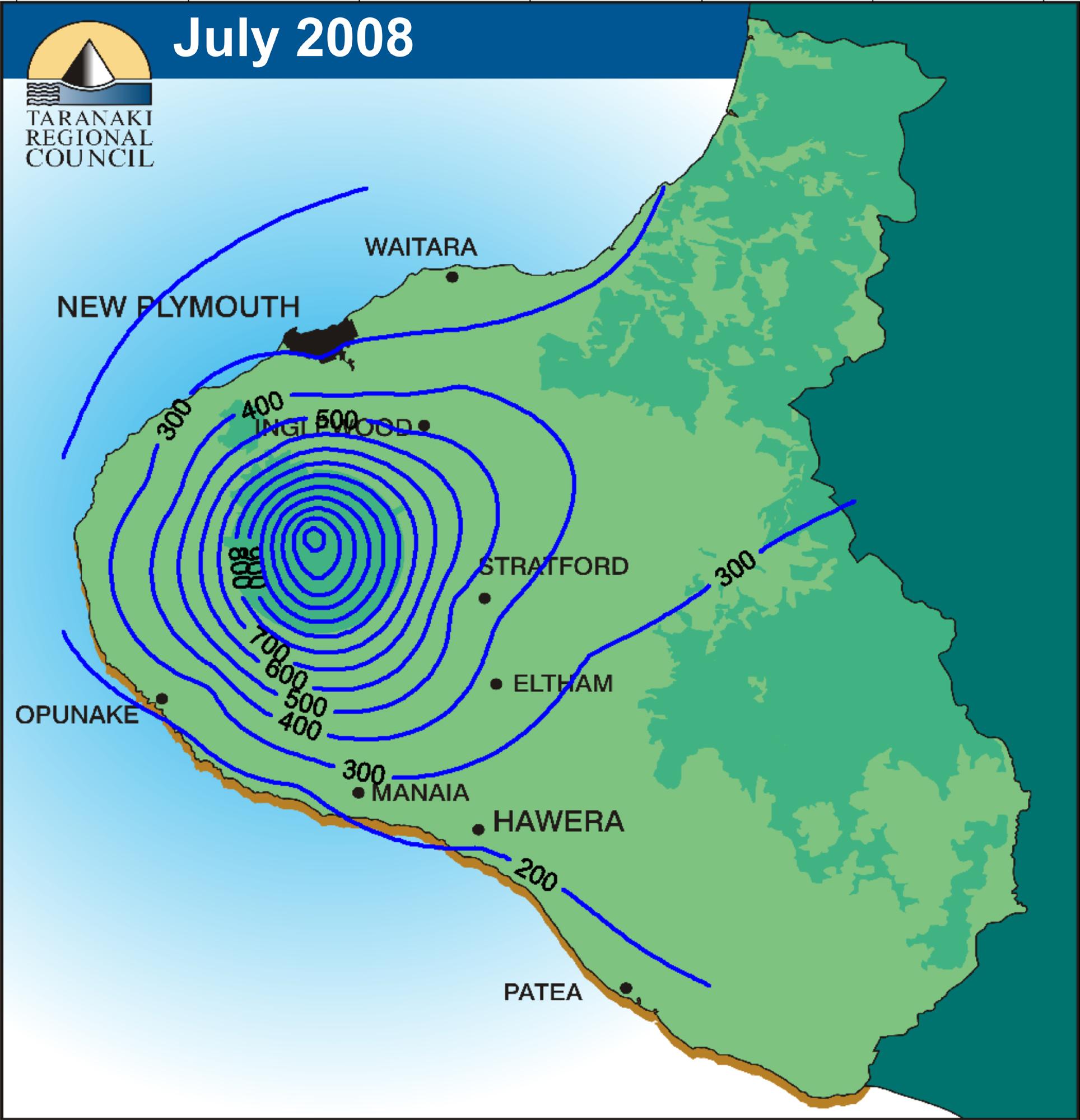
#24 - Isopach
Seen here is an Isopach map, which is measuring thickness in feet of the Tully Limestone.
 http://www.searchanddiscovery.com/documents/2007/07022lash/images/2_18.htm
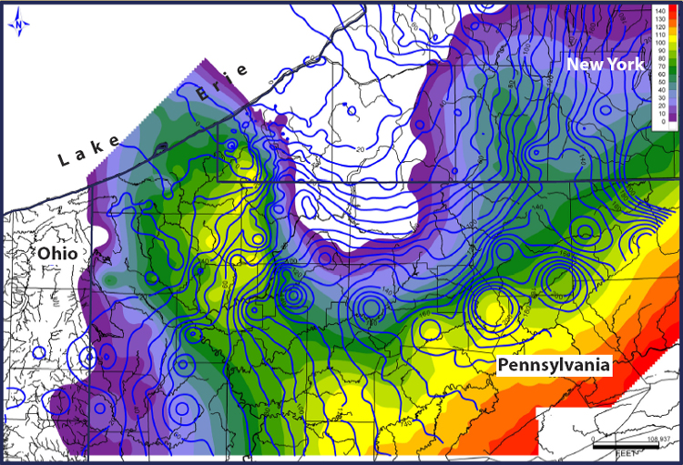
#23 - Isohyet
The Isohyetal map below shows line that join points of equal precipitation. The map below is displaying rainfall measurements.
 http://www.scoop.co.nz/stories/AK0808/S00090.htm
#22 - Isotach
Below is a map using Isotachs to show lines of equal wind speed. This type of map is used when displaying wind measurements.
 http://www.examiner.com/weather-in-chicago/turning-cooler-and-windier-late-week-picture?slide=37955561
#21 - Isobar
The image below shows Isobars, or lines of equal or constant pressure.
 http://www.sciencephoto.com/media/147957/enlarge
#20 - LADAR
The LADAR image below uses laser technology to measure elevation levels at Ground Zero. This image shows emergency management personnel vital information about the changes and damage to the area.

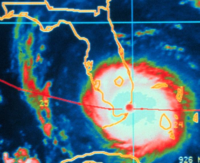
#19 - Doppler Radar
The Doppler Radar image below is one that we are most familiar with from the local newscasts. This image gives us a real-time visual of the storm as its passing over.
 http://www.noaanews.noaa.gov/stories2004/s2311.htm
#18 - Black and White Aerial Photo
Below is a Black and White Aerial Photo of beaver activity from Sweet Briar College in Virginia

#17 - Infrared Aerial Photo
The Infrared Aerial Photo below shows vegetation patterns

#16 - Cartographic Animation
Cartographic Animation shows us images of the weather in a real-time view. Floridians are very familiar with these types of maps, as we see them every year during hurricane season.
Monday, November 21, 2011
#15 - Statistical Map
A Statistical Map shows us the variation in quantity of a specific factor. In this case, the factor is the number of people who are online.

#14 - Cartogram
This Cartogram shows global amphibian diversity amongst different countries. The information is simplified and displayed in a general overview manner.

#13 - Flow Map
The Flow Map below shows the steps it would take to get ready to go in the morning for a Frankley School student. Everything from getting up and getting dressed, to packing a lunch, to arriving at school. All the steps neatly flow in a systematic, chronlogical order.

#12 - Isoline Map
The Isoline Map below uses lines to indicate the annual precipitation rates in Washington in 1996. The lines on this map show that some areas of Washington received up to 160 inches of rain in 1996, while other, much larger areas only received 20 to 60 inches.

#11 - Proportional Circle Map
The circle scaling used in this Proportional Circle Map is a simplified way for map makers to present data and statistics. The image below shows traffic fatalities in the US by state in 2009. As you can see, Florida, Texas, and California have the highest rates in this category.

#10 - Choropleth Map
The Choropleth Map below takes a specific set of data, in this case the number of people who are hispanic, and distributes the data per county. This gives us an image that shows how many hispanics there are per county in the state of Florida.

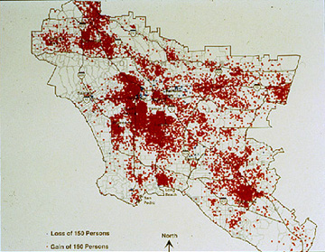
#9 - Dot Distribution Map
The Dot Distribution Map below uses dots to indicate the total hispanic population in Los Angeles.
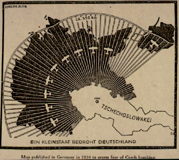
#8 - Propaganda Map
The map below is a good example of a Propaganda Map, showing Germans what the dangers of Czech bombing look like before World War II. As you can imagine, this map was used as a "what if" to insight fear among the people.
#7 - Mental Map
The map below shows an image that was once seen only in the authors head, a Mental Map. This image shows us what the author's neighborhood looks like from his/her point of view.

#6 - Hyposometric Map
The image shown below is of a Hyposometric Map. As you can see, the map is showing changes in elevation in the bottom of the sea floor in the Aegean Sea.

#5 - PLSS Map
The image of the Public Land Survey System was taken directly from the website of the national atlas of the United States. The states in blue are included in the PLSS.

#4 - Cadastral Map
Below is a Cadastral Map of Olmstead Park, Oregon in 1909. As you can see, each lot is assigned a specific number, showing a history of land ownership.

#3 - Thematic Map
The Thematic Map seen here shows the median age in 2000 ina particular geographical area, in this case the Northeast United States.

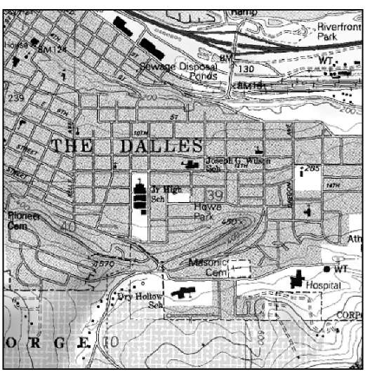
#2 - Topographic Map
The Topographic Map shown below is also of The Dalles, Oregon. Instead of roads and highways, this map shows contour lines which help the reader determine what the terrain and elevation look like.
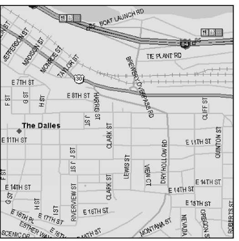
#1 - Planimetric Map
Shown below is a Planimetric Map of The Falles, Oregon. As you can see, the map details highway and road names, but leaves out most information about the physical terrain.
Subscribe to:
Posts (Atom)